
In an increasingly crowded marketplace, where thousands of new books are published each year, first impressions are everything. A book cover must captivate a potential reader in mere seconds. While some covers scream for attention with vibrant colors, elaborate illustrations, and complex typography, a growing trend takes the opposite approach: minimalism. Minimalistic book covers, with their clean lines, restrained color palettes, and deliberate simplicity, have carved out a powerful niche in the world of publishing. This article explores the enduring appeal, design philosophy, and impact of minimalistic book covers—and why they’re more than just a passing trend.
1. What Defines a Minimalistic Book Cover?
Minimalistic book covers are characterized by the principle of “less is more.” Instead of cluttered visuals and excessive design elements, minimalistic covers focus on:
-
Clean and simple layouts
-
Limited color palettes
-
Ample use of negative space
-
Bold, readable typography
-
Subtle or symbolic imagery
The design is typically elegant and restrained, often conveying complex ideas through a single visual metaphor or even just text. It’s about removing everything that isn’t essential, leaving only the elements that directly communicate the book’s tone, message, or theme.
2. The Philosophy Behind Minimalism in Design
Minimalism as an art and design movement has its roots in the early 20th century, but it gained significant momentum in the 1960s and 1970s. It was a reaction to excess—a push toward clarity, focus, and simplicity.
In book cover design, minimalism serves several philosophical functions:
-
Clarity of message: By stripping away distractions, the core message stands out.
-
Modern aesthetic: Minimalistic designs often feel contemporary and sleek.
-
Universal appeal: With less specific imagery, minimalist covers can appeal to a broader audience.
-
Trust in content: A minimalist cover often suggests confidence—the author doesn’t need flashy graphics to sell the book.
3. The Psychology of Minimalism: Why Readers Are Drawn to It
Readers today are bombarded by constant visual noise—advertisements, digital screens, social media feeds, and bright, flashy marketing. In this environment, a minimalist book cover can feel like a breath of fresh air.
Psychological reasons readers are attracted to minimalist covers:
-
Perceived sophistication: Clean, simple designs are often associated with quality and high-end products.
-
Less cognitive load: Minimalist visuals are easier for the brain to process, allowing the viewer to quickly grasp the message.
-
Curiosity through mystery: A cover that doesn’t reveal much can make readers more intrigued about what lies inside.
This subtle appeal is why minimalism works so well—it creates intrigue without shouting.
4. Genres That Embrace Minimalism
While minimalistic book covers can be found across all genres, they are especially prevalent in the following:
a. Literary Fiction
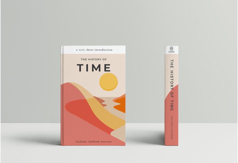
Often focused on introspective themes, literary fiction embraces minimalism to reflect emotional depth and subtlety. Covers in this genre often use abstract shapes, muted colors, or stark typography to match the tone of the narrative.
b. Non-Fiction
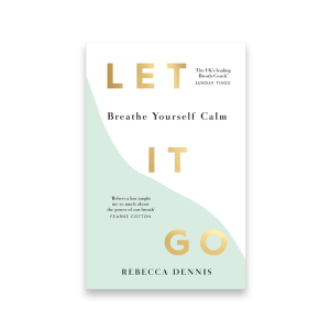
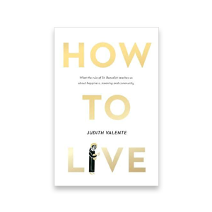
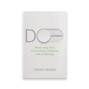
In genres like business, psychology, and self-help, minimalistic covers project authority and clarity. A clean cover signals focus and no-nonsense information—qualities valued in instructional or informative books.
c. Poetry
Many poetry collections adopt minimalist covers to reflect the purity and emotional rawness of the content. A single symbol or a simple word on a blank background often mirrors the sparseness of poetic language.
d. Modern Classics
Reprints and anniversary editions of classic novels are often redesigned with minimalist covers. This gives them a timeless, updated look that appeals to new generations of readers.
5. Design Elements of a Minimalist Book Cover
To understand what makes a minimalist book cover successful, it’s important to look at the core design elements that define the style:
a. Typography
Typography is often the focal point in a minimalist design. Fonts are usually bold, clean, and sans-serif, but serif fonts are also used for a more classic touch. The size, spacing, and placement of text are carefully calculated to draw attention and provide balance.
b. Color
Minimalist covers typically stick to 2–3 colors, often including black, white, or greyscale. Accent colors might be used to highlight a specific element or create contrast. Muted or pastel tones are also common.
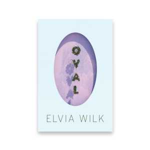
c. Imagery
If used at all, imagery is symbolic or abstract rather than literal. A single icon, shape, or object might be employed to represent the theme or central idea of the book.
d. Negative Space
Also known as white space, negative space is the blank area that surrounds and separates design elements. It helps create balance, direct the eye, and prevent visual clutter.
6. Famous Examples of Minimalistic Book Covers
Some iconic minimalist book covers have become celebrated examples of modern design:
“Sapiens” by Yuval Noah Harari
The minimalist approach—simple typography and a symbolic fingerprint—communicates the essence of human evolution and identity with visual clarity.
“1984” by George Orwell (Penguin Classics Edition)
Several modern editions feature simple black-and-white designs with a stark red accent, creating a mood that reflects the book’s dystopian tone.
“The Great Gatsby” (Minimalist Editions)
Stripped-down versions with just the title and a simple symbol (such as a green light) showcase how minimalism can breathe new life into classics.
7. Minimalism in the Digital Age
With the rise of eBooks and online shopping, book covers now need to stand out in thumbnail form. Ironically, minimalistic covers often perform better in this environment. A bold title on a clean background is easier to read and more recognizable when scaled down.
Digital platforms like Amazon or Goodreads reward visual clarity. Minimalism provides that clarity, especially in a grid of competing covers filled with busy visuals.
8. Pros and Cons of Minimalistic Book Covers
Pros:
-
Timeless aesthetic that doesn’t rely on design trends
-
Versatile across multiple genres
-
Enhances professionalism and perceived value
-
Reduces distractions, increasing focus on title and author name
Cons:
-
May be overlooked if not executed thoughtfully
-
Risk of appearing too plain or generic
-
Requires strong design intuition to be effective with fewer elements
While minimalism may appear simple, it often requires more planning and design discipline than more complex styles.
9. The Future of Minimalist Design in Publishing
Minimalistic book covers are not a trend—they are a design philosophy that aligns with modern consumer preferences for clarity, elegance, and authenticity. As attention spans shorten and visual fatigue increases, the demand for clean and calming visuals is likely to grow.
With advancements in AI-assisted design tools, minimalism may become more accessible to self-published authors and small publishers, helping them stand out without extensive budgets.
Conclusion: The Power of Less
Minimalistic book covers prove that restraint can be a powerful creative force. By stripping away the unnecessary and focusing on clarity, emotion, and form, minimalist designs invite the reader to pause, reflect, and engage. Whether you’re a reader looking for thoughtful content or an author seeking to make a quiet yet memorable statement, minimalism offers a compelling way to stand out in a noisy world.
In an age of constant stimulation, the quiet sophistication of a minimalistic book cover speaks volumes.
You might also enjoy Negative Space Book Covers and Orange Book Covers