
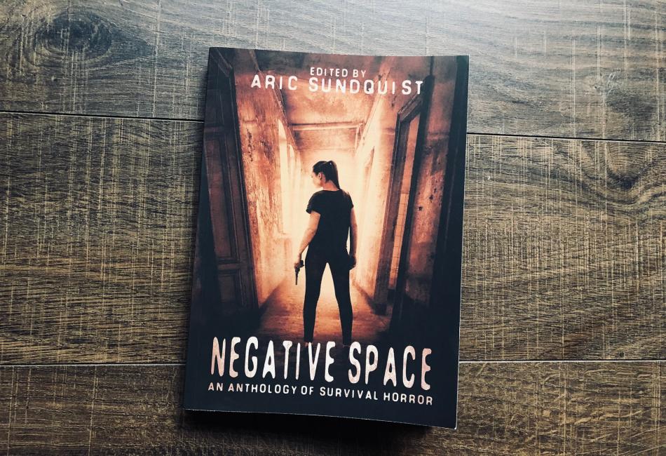
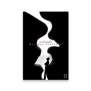
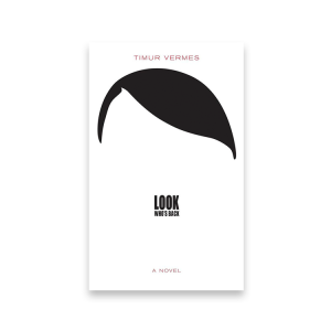
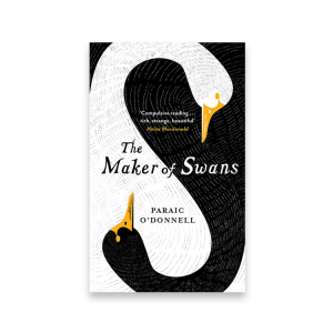
Negative space book covers are one of the most popular cover design trends right now. And for good reason! They’re eye-catching, unique, and often very stylish.
If you’re thinking about using negative space on your book cover, there are a few things you should keep in mind. First, negative space works best when it’s used sparingly. Too much negative space can make your cover look unfinished or unbalanced.
Second, negative space should be used to create a contrast between the foreground and background elements on your cover. This contrast will help your book stand out on shelves and online.
Finally, remember that negative space is just one element of good cover design. Make sure to use it in conjunction with other design elements, like color and typography, to create a well-rounded cover that will grab attention and communicate your book’s message.

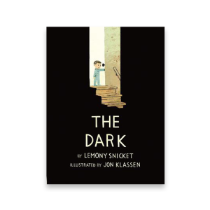
Negative space book covers exemplify the power of restraint in visual storytelling. By using the empty space around and between design elements, these covers invite readers to pause, think, and engage more deeply. Rather than overwhelming the viewer with information, they create intrigue and elegance through simplicity. Whether emphasizing a single symbol, highlighting bold typography, or framing an evocative image, negative space enhances clarity and impact. In an era where visual clutter is everywhere, book covers that embrace negative space offer a refreshing sense of balance, sophistication, and timeless appeal—proving that what you leave out can be just as important as what you include.
You might also like Green Book Covers and Retro Book Covers